Español
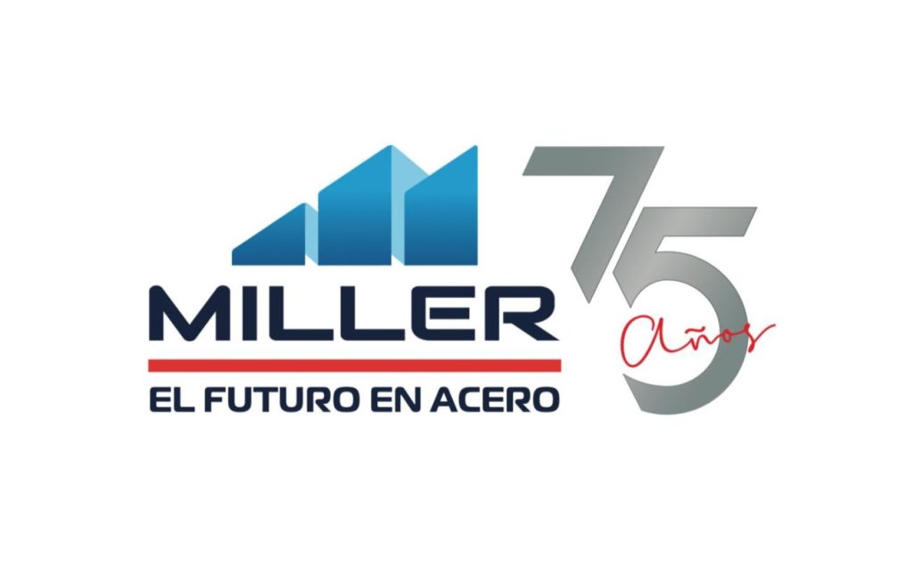
Miller Building International is a leading company in the industrial warehouse construction sector, recognized for its excellence in the quality of its projects and services. As part of its growth and modernization strategy, the company has carried out a complete renovation of its corporate image, logo and aesthetics, with the aim of reflecting its commitment to innovation, creativity and quality.
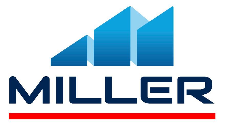
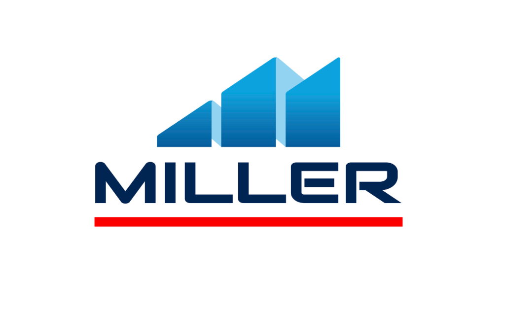
Miller’s new logo presents a modern and elegant design, with clean and clear typography, which conveys the confidence and professionalism that characterizes the company. The colors used, in blue and red tones, provide so much confidence, knowledge and innovation, they adapt perfectly to the image of a leading company in the sector for more than 70 years.
The renewal of the company’s corporate image was not limited only to the logo design, but also extended to the entire brand aesthetic, including its website, brochures, business cards and other marketing materials. The result is a more modern and updated aesthetic, which reflects its brand promise: “The Future in Steel.”
This image renewal not only highlights its commitment to innovation and quality, but also demonstrates its ability to adapt to market changes and the needs of its clients. With a renewed and modern image, Miller is in a privileged position to continue leading the sector, offering creative and innovative solutions to its clients throughout the country.